Search This Blog

Saturday, December 10, 2016

Animal Bodies, According to Hamm

Much thanks and appreciation to Mai, CieJei, Leena, Prudence, Aiden and Adryan for coming out to class tonight. I am very glad that several of you are making it to class pretty consistently. I enjoy the chance to really see you develop your skills over time.

These helpful tips are from Jack Hamm's How to Draw Animals. You'll note that Hamm's style is very old-fashioned and not beautiful. But as I mentioned in class tonight, his observations are helpful,  original and can encourage you to make your own.

See you next year!

JH
 

JH

Wednesday, December 7, 2016

JetPens.com

Here are a few links that might be helpful:

http://www.jetpens.com/Brush-Pens/ct/221
I saw three of my very favorites there: the Zebra fine and super fine and the Tombow Fudenosuke. I notice that they sell sampler packs--smart.

http://www.jetpens.com/Comic-Manga-Pens/ct/845
 http://www.jetpens.com/Comic-Markers/ct/3133

Enjoy exploring!


JH

Sunday, December 4, 2016

An Image File Is Worth a Thousand Words

Hey, Y'all:

To better understand the file layering system I'm championing, please download this big Photoshop file from my website:

http://heebink.com/SatComxCls/Elvira%20print_MASTER--LAYERD.psd


Open it and monkey with it! Click the layers on and off so you can see what's up.

Keeping and locking the Flats layer like this aids in getting clean selections in even heavily reworked areas, as mentioned in the last post. To see how:

  1. Leave all layers visible (eyeballs open).
  2. Highlight Flats layer.
  3. Use Magic Wand tool. It should be set to a tolerance of 1 or 2, with the Contiguous box and Sample All Layers unchecked.*
  4. Click on any area in flats layer; highlight Render layer and edit as you will--inside a clean, hard selection! --which you can revisit at any time till you either flatten/merge the file or change to CMYK!
Have a great week, everybody. See you Saturday.

JH

* To match this setting in Manga Studio/ClipStudio Paint, uncheck these boxes: Follow Adjacent Pixel and Multiple Referring.

Saturday, December 3, 2016

Photoshop Coloring Tips

First post in a while. Thanks for coming, everybody. Nice to have old hands Larry and Adryan with us as well as newcomers Prudence, Gary, Joad, and Mai.

HOLIDAY SCHEDULE REMINDER: Class will not meet on the 17th or 24th of December.

Here are some basic, yet detailed instructions on coloring comics in Photoshop.

A note about Photoshop: There is no one way to do anything in Photoshop. What follows here is the way that I think makes sense. There may be others as good.

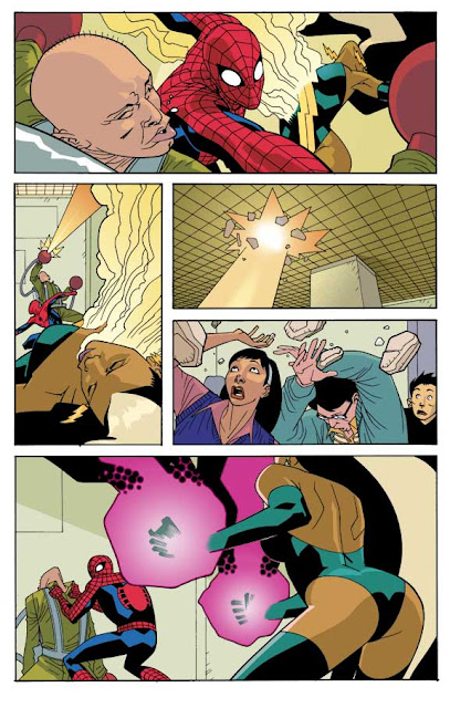
Spider-man art by Ryan Ottley, coloring by JH. Unpublished.
Many Photoshop users are comfortable creating many, many layers. Modern computers are fast enough to quickly save the resulting huge files, but I say creating many layers is a terrific time-waster! A few layers are all you need: Line art, flats, rendering/modeling and perhaps a few more. (Tone screens, if any, are best added in Manga Studio/Clip Studio Paint, late in the process.)

My method makes naming and hunting through all those layers unnecessary.

One note: Manga Studio/Clip Studio Paint is a terrific program, especially for filling blacks and adding tone screens. It is much quicker--and more fun--than Photoshop in these areas. I think that it is also excellent for flatting, that is, the placing of flat placeholder colors. You will have to experiment with paint bucket settings to make sure that the bucket slightly overfills the open area, using the Area Scaling slider.  Be aware that MS/CSP is very friendly with Photoshop's .psd files. It is easy to go from one program to the other with a piece of art.


PART 1

SCANNING

Turn on the scanner and your computer and open Photoshop ("PS," hereinafter). Click on the File pull-down menu and choose Import. Choose Import Images from Device. See if the name of your scanner, its software, or its manufacturer is among the options. This should open your scanner software.

    The best way to do Photoshop is to begin with a good scan. If your scanner is smaller than 11x17, make a good quality Xerox reduction of the page, at 65%, or whatever easily fits. For inked art, set the mode of the scanner software to Lineart or Bitmap. This setting means that every pixel will be assigned either to black or white. So you get maximum contrast from the start. Set the resolution to 800 ppi or even 1000ppi.

    If your art is penciled, or has ink wash, or areas of dry marker-- if there are parts that aren't decisively black and white and you want that look in your final--you may want to scan in Grayscale

    Scan now. Go to PS to see your image. Zoom to pull in closer to see if you got a good scan, or if you need to readjust the scanner settings and scan again. A good scan is one that has a minimum of unwanted pencil lines picked up, yet is free of line breakup, or holes in areas with thinner ink coverage.


BASIC FILE SETUP

 Before you can do anything to your file, you have to change it to a grayscale-mode file in PS, unless you scanned in grayscale. Go up to the Image pull-down menu, and go down to Mode and select Grayscale from the submenu. (Put another way: Image>Mode>Greyscale, which is the way I'll designate these pull-down menu selections from now on). It'll ask you what Size Ratio. You want 1. 

    Choose the Crop tool from the tool box. You can get it typing “C.”   In the window of your file, click and drag diagonally corner-to-corner to designate how your file will be cropped. If the art is crooked within the frame of cropping tool, position the cursor just outside the handles at any corner. You'll see a little curving double-headed arrow that will allow you to slightly rotate the rectangle of marching ants to match the tilt of your art. Now that you know it's all square and true, you can reposition the little square handles on the corners to refine the crop.

    Now hit Return. This completes the crop. 

   Go to Image>Image size. In the dialog box that opens, change the resolution to 300, AT LEAST. 400 is great. Over 500 is overkill. Click OK. AFTER resetting the resolution, leave the dialog open and look at the file dimensions in inches. In the Document Size area, put in 6 in.  for the width. This is standard print size for the width of a comic book page (non-bleed). The height will automatically update to about 9 in. You should have the "Constrain Proportions" box checked.

    (You cannot usefully boost the resolution of a file later if you accidentally reduce it too much. PS's ability to interpolate the missing info is limited.)

    Save!

    You can use the eraser tool (type "E" on your keyboard) to fix any obvious glitches. Save again. See you in Part Two.
_____________

PART TWO

    Rested? Now to set up your file for coloring:
    Look at the Layers Palette in your lower right screen. Double-click on the layer called Background. This is important. If you don't rename this layer, it will have some annoying characteristics. Call this layer "Line Art." Save. At this point, duplicate this file as a backup (That is, save it under a slightly different name--maybe just add BU for backup). You can duplicate it on your computer, the cloud, or a thumb drive. The copy can serve as your repair file if you or your computer screw up. 

    Now, back in your original file, change the mode to RGB (Image>Mode>RGB).

    "WHY WORK IN RGB? I THOUGHT CMYK WAS FOR PRINTING." You're right about that, but that doesn't make you smart, Mr. Questions. All filters work in RGB, but not all in CMYK. You change the RGB file to CMYK at the end.

    Or if you want to work in CMYK, so that you don't have to worry about out-of-gamut colors (see below), you can do that. Whichever mode you choose for this file, do it now, for good, before  you start “flatting.” It's a bad idea to change modes of a file that's already flatted. You won’t get clean selections with the magic wand later. 


SELECTIONS and "FLATTING"

(Here is where you can save time by saving, then opening the file in MS/CSP and flatting there.)

    In the flatting phase, all your selection tools (magic wands, lassos, etc.) should be set to not anti-alias. Go through them one-by-one to check.  You must also use the pencil rather than any brush. The eraser tool should be set to the Pencil or Vector option. To instantly fill selections, hit alt-backspace (option-delete), not the paint bucket.

    "WHAT IS ANTI-ALIASING?" It allows tools, such as an airbrush, to act less than fully on pixels that they touch less than fully. When you zoom way, way in on something anti-aliased, like type, it's blurry right around the edge, rather than jaggedly bitmappy.  Why is it a problem to have anti-aliasing in the flatting? Because you want every pixel to be fully one color or another. No mixed states. This is so later you get a clean, complete selection with one click of the magic wand! Then you will never have to worry about coloring outside the lines, and you never have to have more than a few layers.


    Now you have a color layer--name it "Flats"-- and a line-art layer. I like putting the line-art layer on top. For now, it's best that you do too.  The key thing is that the top layer needs to be in the Multiply blend mode. So you select Multiply from the pull-down menu of blend modes near the top of the Layers palette. THIS IS COOL! This will allow your line-art to optimally combine with the color layers. AND it allows you to do your color work separately from the line art so that if you redo some coloring, you won't destroy any of the line art, or the original Flats layers, which you can lock for safety once you're done flatting.


    Then you unlock the new, flatted color layer if necessary and use the Paint bucket (keyboard shortcut G) --set not to anti-alias, with a tolerance of 1 or 2 and "Contiguous" unchecked, -- to replace placeholder colors with better ones.

    MAKE SURE that every object--or differently-colored part of an object--on your page has its unique color and that this color is the same every time the object appears. This comes in handy when revising. Try to do this paint-bucket revising quickly. Don’t spend time choosing the just-right color for everything. Go quickly It's easy to select and edit colors later.

    When done with any color replacements, you are almost done with flatting. So now, duplicate the Flats layer and call that new layer “Modeling.”  Now lock off the top and bottom layer, i.e., Line Art and Flats. Why do you keep a locked-off copy of the flat colors layer? I'll explain that nearer the end.

    You may later add adjustment layers, layers for glowing light effects, but your basic file structure concerns just these basic three.
_______________________


PART 3

MODELING

Now you enter a distinct phase that allows you to get expressive. Say bye-bye to the pencil. You now have the whole universe of brushes to choose from, so select the brush icon in the toolbox. Change the eraser to brush mode. You are free to change all the selection tools to anti-alias for smoother-edged selections. 

In the Magic Wand options, uncheck "Use all layers" and uncheck "Contiguous." Set the tolerance to 1 or 2. This is so, with a single click, you will have a clean selection of every bit of that exact color that appears on the page. You will never need to worry about coloring outside the lines.

So, working inside a magic-wand selection, paint away. Pretty it up. I do my basic modeling with huge soft airbrushes or sometimes gradient fills to make it rounded, subtle, continuous. I use the Color Picker or Color Palette sliders to make the foreground color into a highlight color--that is, a lighter, purer version of the local color I'm working on. Then I type "X" to switch background and foreground colors and create a shadow color.  The shadow color is, of course, a darker version of the local color. Thus I can switch back and forth as needed, by typing X or clicking on the double-headed arrow symbol near the foreground and background colors at the bottom of the tool box. (If you're working in RGB, mind the triangular yellow out-of-gamut alert icon that appears in the Color Palette and Color Picker. Click on it if it comes up. This corrects the color to one that actually be printed and hugely lessens the shock of the change to CMYK at the end.) Move through the whole page, modeling every occurrence of that color, as desired, if desired, in turn.

If you are enough of a painter to know the difference between form shadow and cast shadow, cast shadows that fall short distances should be harder-edged than all other shadows. Painters say that all shadows start as form shadows (soft edged) and end as cast shadows (hard).


Gradients add a lot, especially for skies (darker at the top), and can also substitute for paintbrush modeling on many forms.

DO WE KEEP THAT ORIGINAL FLATS LAYER? GIVEN THAT IT’S LOCKED OFF AND HIDDEN BY THE MODELING LAYER, WHY WOULD WE?

Yes, keep it till you flatten the file and convert the file to CMYK. The glory of this method: By highlighting the locked-off Flats layer in the layer palette and using a single click of the magic wand (tolerance of 1 or 2, NOT set to "Use all Layers"), you can still get an instant clean selection of, say, the lead character's skin, everywhere it appears--EVEN AFTER IT'S MODELED on the modeling layer! Now you re-highlight the Modeling layer and use Image>Adjustments or your paintbrushes to edit the color in question, either as a group (with Adjustments) or singly (with brushes). WOWEE!

THAT'S why you will keep a copy of the still-layered file (see below) till you get all necessary okays from your boss(es): quick selections for changes.

Highlight the Line art layer. Select all. Use the Magic Wand with a tolerance of 1 or 2 and set to only read this layer and leave “Contiguous” unchecked. Option-click in the white area to subtract all white. Go to Select>Save Selection… Save it as “Color Hold Mask” or some such. You’ll see why in a second.

Save the file and then save-as under a new name, by adding "final" or "flattened" or "CMYK" to the file name. Convert to CMYK and merge (or "flatten") the layers. If you've been careful not use out-of-gamut colors, you won't get a big surprise. If not, you will find bright, rich oranges and greens and deep dark reds and blues, etc., getting duller and more average-looking. After the color hold work (see immediately below), you may want to boost the contrast of the whole file by 8 or 9 points to compensate. (BTW, Photoshop color settings are helpful in avoiding muddiness or hue shifts in the printing, but need to be discussed with your pre-press person or editor. Let's just assume we're doing this file for your online portfolio and not worry about print or editors or color settings.)

Now that the layers are merged, you can do your color holds: Go to Selection>Load Selection… to load your “Color Hold Mask” channel, and begin selectively coloring the lines with a brush. Using control-H (or Cmd-H) to hide the marching ants will help you see what you're doing. The lines around flames, electrical or magical effects are great candidates for color holds.  You can also use color holds to visually differentiate background areas from foreground areas. In normal, even, lighting situations, atmospheric perspective dictates that the farther outlines be lightened, not the near. Don't use color holds to excess. Overuse looks cheesy. For cleanest results, use colors that still have a pretty high proportion of black in them. 

Finally, save, and save-as a png as well.

Holy cow, you're done. Don't be discouraged if the whole process takes you 15 or 20 minutes; you're learning, after all. 

(Just kidding: your first pages will take several hours each.)


JH

(Thanks to Paul Rivoche for acquainting me with key parts of this method. I also very strongly recommend the DC Comics Guide to Coloring and Lettering Comics, by Mark Chiarello.)


Sunday, October 23, 2016

Explaining the Reflect-y Ball... Betterly

I found a better version of this important point I tried to make a few weeks ago, about how reflections work. I drew this a few years back for a student who, I can almost guarantee you, did not incorporate the insight into his thoughts. It was all by way of urging him not to put highlights at the edges of objects--unless doing rim lighting, which is a specific situation, explained in the third sketch here.

Rim lighting can be quite lovely. They loved it in old pulp magazine covers. Note the very realistic use of it here on the face and skull.


JH


P.S.: 100% sure the artist worked with a model for both the man and the skull. Not just because the rim lighting is so realistic. Look how he captures the light passing through the thinner places in the bone! So nice. Not something one would automatically think to include...

An Experiment

Thought this might be of interest. Here's a drawing of Red Sonja I did...
I printed it out in blue on copy paper, editing it a little, especially the expression...

...And then inked it with the Sakura Pigma brushpens I showed you guys last night.

It worked out pretty well, I'm claiming, but for a couple places where I used a soppy Pentel brush pen and it bled.

I live for Science!
JH

Sunday, October 2, 2016

We Go Figure

Hi, Everybody!

Thanks for turning up and taking part in our Oct 1 class, Francisco, Mariel, Jonathan, Daniel, Ellen, Ricky, Sketch, Martha, and Patricia!

I was a nervous teacher Saturday because my figure drawing skills are rusty, at least as regards technique...

I put a lot of concepts out there--more than advisable,  I think, considering none of them really mean a thing till YOUR practice, exploration and goofing around make them real. If, with your kind patronage, we can make the class an ongoing thing, together we'll put meat on the bones I threw at you Saturday!

Analysis!

Here, from Andrew Loomis's Figure Drawing for All It's Worth, is a better version of that ball I showed you last night. His seems modeled on a white plaster sphere.
Loomis

Loomis divides into 5 ½ zones what I encouraged you to think of in three. As a mental exercise, see if you can simplify these into the three I showed you in those nude pix:

  1. Highlight, 
  2. Mid-tone, 
  3. Shadow. 

(Saturday I forgot to mention D., "Moonlight," which is a bit of faint reflected light "opening" the form shadow. It's bouncing off the surrounding white surface to the underside of the sphere and thence to our eye, so it can be weak.)

Inspiration!

I mentioned George last night, George Cwirko-Godycki. Please follow him on Facebook! His technique seems to spring from fearlessness and constant drawing.


Thanks!
JH

Wednesday, September 28, 2016

Change-Up on Saturday!

Important Announcement, you guys:

This Saturday, our regular Comics/Manga class is going to be REPLACED by our first LIVE FIGURE DRAWING CLASS--just this once. I'd strongly encourage you to come. Bring a big newsprint pad, some sticks of compressed artist's charcoal, a sandpaper pad, and no eraser! :)

Here's the email that Joseph, owner of Stevens Books, has released:


Figure Drawing Course with live models

First class is FREE! 5pm - 7pm on Saturday - October 1st

Get proficient in drawing figures with our highly qualified instructor John Heebink. Our sessions with live models (male & female) are extensive and fun.

Through this class you will learn:
- Ability to see and capture proportions
- A drawing method that minimizes mistakes, erasing, wasted time
- A feel for the dynamics of clothing folds
- Increased knowledge of light on form
- Comfort with the tools and practice of figure drawing

Program Information:
Age                         : 18+
Duration                  : 4 lessons/ month
Subscription            : 4 months (payment monthly, credit card or cash)
Schedule                 : 5:30 pm - 7:00 pm Tuesdays
Fee                         : $100 /month
* Artists should bring their own supplies.

Seats are limited, so please sign up before September 30 at sf@stevensbooks.com or call (415) 859-5371


JH

NOTICE:
I have a pen that I don't believe is mine: a Kuretake Zig Managka Flexible. It's terrific! I'll bring it in Saturday. Speak up if it's yours, or leave a comment here.

Speaking of such things: A reminder that you can find all sorts of great Japanese inking and sketching tools at jetpens.com

Change-Up on Saturday!

Important Announcement, you guys:

This Saturday, our regular Comics/Manga class is going to be REPLACED by our first LIVE FIGURE DRAWING CLASS. I'd strongly encourage you to come. Bring a big newsprint pad, some sticks of compressed artist's charcoal, a sandpaper pad, and no eraser! :)

Here's the email that Joseph, owner of Stevens Books, has released:


Figure Drawing Course with live models

First class is FREE! 5pm - 7pm on Saturday - October 1st

Get proficient in drawing figures with our highly qualified instructor John Heebink. Our sessions with live models (male & female) are extensive and fun.

Through this class you will learn:
- Ability to see and capture proportions
- A drawing method that minimizes mistakes, erasing, wasted time
- A feel for the dynamics of clothing folds
- Increased knowledge of light on form
- Comfort with the tools and practice of figure drawing

Program Information:
Age                         : 18+
Duration                  : 4 lessons/ month
Subscription            : 4 months (payment monthly, credit card or cash)
Schedule                 : 5:30 pm - 7:00 pm Tuesdays
Fee                         : $100 /month
* Artists should bring their own supplies.

Seats are limited, so please sign up before September 30 at sf@stevensbooks.com or call (415) 859-5371

Instructor Biography:
Teacher John Heebink he has taught kids from all over the world. He taught for ten years in the Academy of Art Illustration Department, specializing in comics, figure and head structure and perspective, at graduate and undergraduate levels.Since 1991, he has worked as a professional comic-book artist, handling mainly penciling, also writing, inking, lettering and Photoshop coloring. His credits comprise Elvira Mistress of the Dark, Nick Fury Agent of SHIELD, Space Chicks and Businessmen, Power Rangers, Doll and Creature, Vampirella, and more. His work is characterized by lively expressions and body language.

JH

I have a pen that I don't believe is mine: a Kuretake Zig Managka Flexible. It's terrific! I'll bring it in Saturday. Speak up if it's yours, or leave a comment here.

Speaking of such things: A reminder that you can find all sorts of great Japanese inking and sketching tools at jetpens.com

Some Style Experiments

Fellow learners:
You may be interested to see a couple examples of my current struggles--I'm trying to devise a "new" style of working that I can reasonably sustain through many pages, despite the fact that my hands are shakier than they used to be.

I'm striving to do that most impossible thing: keep it simple. I'm doing so-so on that score.

This is for a pet project that I want to present digitally. It's a futuristic story, but it starts in the past:


And this guy is a character I doodled in a sketch book. I'm gonna keep an eye out for an opportunity to put him into my project. I think he's got an interesting mug.

I've been practicing what I preached about grabbing Photoshop swatches from photos. The top two panels use a palette based on this photo of Aziz Ansar et al:
See you Saturday!

JH


P.S.:
I have a pen that I don't believe is mine: a Kuretake Zig Managka Flexible. It's terrific! I'll bring it in Saturday. Speak up if it's yours.

Sunday, September 25, 2016

Inking drills!

Great way to warm up before inking on bristol. Get in touch with all your tool can do when you push it, and you'll ink more fearlessly, I promise.

P.S.: Check out jetpens.com for the best in Japanese inking tools!

JH


Friday, September 2, 2016

....BONUS TRACK! Another Palette Creation Trick!

For a modern, super-harmonious palette for your art:

  • Save your current set of swatches if you want.
  • In the Swatches palette dropdown, load a set of swatches from the list. This one below is called "ANPA Colors." Its virtue is its medium, manageable size.

  • Do a screen capture. (Shift-cmd-3 in Mac, turn the top crank counter-clockwise on a PC)
  • Open the resulting file in Photoshop. Add a new layer, in the Multiply blend mode.
  • Fill (opt/alt-del) that top layer with any primary or secondary hue--pure and light, no browns or grays.
  • Adjust layer opacity to your taste.


  • Eyedropper the colors onto the Swatches palette and save, as detailed in the prior post!


COOL!

JH

PS: Yes, I monkeyed with the third row to make some nearly white hues. Good for highlights!

Custom Palettes

Hey, Picasso said art is theft. So when you see a pretty picture, steal its colors for use in Photoshop! Here's how I do it.

I feel like there's got to be a better way to do this, in either Photoshop or Manga Studio, so....
If you know one, PLEASE, PLEASE leave a comment.

Off we go---


  • Start with a picture whose colors please you. Open it in Photoshop. (You may want to save your current palette via the Swatches palette's tiny drop-down menu in the upper right)


End of the season, Lake Michigan-- photo Tom Hollowell


  •  Click on Filter>Filter Gallery>Mosaic  Voila!


  •  The resulting mosaic titles contain only single flat hues. Using the Eyedropper Tool {I}, pick out a range of colors, clicking on the open part of the Swatches palette after each to enter them.


  •  Holding down Option (alt)  as you enter your swatch saves you a 2nd click.


  • Lastly, Save your new palette, as an .aco file, using that Swatches palette drop-down menu in the upper right.


If you know a better way, please share it with us in the Comments!
JH


Tuesday, August 30, 2016

A Final Word on Lettering...

...that probably should have been the first.
Courtesy of Richard Starkings's Comicraft:

This is all absolute gospel! 

I only add that a too-fat pointer or tail is a lot better than a too-thin one, and could be legitimately be a part of a style. Oh, and that pointers should stay off the characters as a (very) general rule and should point to the source of the dialog, often the mouth. Oh, and that tail-less balloons are weak-ass, a copout, most of the time.

Otherwise, nothing to add!


JH

Monday, August 29, 2016

Illustrator's Pay

I have no idea if this is correct but I just saw on this art jobs site that SF illustrators make about $36/ hr. Hmm! Not bad. Hey, no one ever promised you wouldn't have roommates till your 40s.
JH

Famous Artists Cartooning Course

Oh my gosh! I found a site where you can download the famous Famous Artists course for free. Its copyright has expired, so it's all legit.

You're not gonna love every cartoonist, but there are many, many artists and styles represented, and a lot of them were heavyweights back in the '50s, when I assume this came out.

And here is where I presume you are adult, and can divine for yourself which instances of stereotyping are inherent to good cartooning and which are artifacts of a less sensitive and less aware time.

That said, download away and enjoy! A lot of this is timeless and golden.

JH


Thursday, August 25, 2016

Lettering

Here, courtesy of DC's excellent series of books, The DC Comics Guide to... is a brief but very helpful rundown on how to letter in Illustrator.


From the excellent The DC Comics Guide to Coloring and Lettering Comics 
by Mark Chiarello and Todd Klein


Please click to enlarge and save them! Very useful. Note that one page above, 131, is in a different aspect ratio and may be very easy to overlook as you click on each. It does come after p. 130.
JH

Saturday, August 6, 2016

Scribble Method!

Hi, you guys.

Thanks to Charles, April, Dee and AiLing for coming today.

So it's called the Scribble Method, not the "Doodle Method." Here it is demonstrated by John Buscema and Stan Lee in the indispensable and inexhaustible resource How to Draw Comics the Marvel Way. Click on these to enlarge.

And here is my own attempt at showing the same idea to a student of mine:

Again from How to Draw Comics the Marvel Way, lively and lovely illustrations of the idea of Line of Action, herein referred to by a different name:

Finally, examples of playing straights against curves in the outline.


Note: Now in reality, these outlines are probably entirely made of curves, but if you were to draw these figures, your drawings would look cooler and stronger if you made the "S" segments straight and the "C" segments decisively curved. I believe that if the "underdrawing" is successful, you can simplify, elaborate, stylize--whatever--the outlines and end up with a solid drawing.

Hey, out of respect for your fellow students and me, please try to arrive on time so I don't have to keep starting over.

Assignment for this week:
Doodle for half an hour WITH NO ERASING!

See you Saturday!
JH

P.S.: Since I'm already exploring the educational power of near-naked pictures, here's some exaggerated runway contrapposto to make the idea crystal clear. Ba-BOOM.


Monday, August 1, 2016

"Why Action Scenes Suck"

Hi, everybody.

This upcoming Saturday, our focus will move away from head construction back to storytelling fundamentals. And so, to that:

Movies and comics are two different things, duh, but with often-similar priorities: Making stories clear, exciting and involving, even if it's just two people talking.

This video races through some of the ways this can be accomplished. Its focus is upon action scenes, but there is a lot of essential truth about all kinds of storytelling being told here, at a breakneck pace:

Link to video: Why Action Scenes Suck

Your challenge as a storyteller is to give viewers a reason to care, whether your story is epic... or personal... or a mix.

To do that, know your characters and have them act and react in character. There's a good example of this in the video, when they show the Hulk vs. Iron Man action scene. Yes, the shots have the longer, more continuous action these guys justifiably prefer. But just as important is what happens when the action stops and there is that terrific pair of facial closeups that brings our attention back to the two personalities in conflict... personalities that were well established earlier in the film. Showing who your characters are means knowing them first.

I hate to be sexist, but I find that female cartoonists have an advantage in this area. Their stories tend to be based on a few key relationships.

One of the glories of the Avengers films is that so much tension and humor comes from Whedon's exquisite knowledge of the relationships of those characters.

Odds are you have a few characters you've made up, whose relationships have a definite character in your imagination.

It all starts with that act of imagining.

BTW, consider how effective it is to show Hulk from above in his tooth-spitting closeup: It gives us Iron man's (briefly) higher--more dominant--vantage point, nicely setting up the continuation of the fight. Hulk is "down," but that look, and the tooth, turn the moment on its head, letting us see he's definitely not out.


JH

Sunday, July 24, 2016

Talking Heads

Hi, folks:

The late, great Wally Wood had a trick: making one panel on a page the dominant one. I call it the "glory panel"; I don't know what if anything he called it.

Here's an old page of mine that has aged better than a lot. I'd been drawing comics for ten years at this point.

It's basically a "talking heads" page: almost all dialog, more emotion than motion. The glory panel (panel 2) serves as an establishing shot. So it created an opportunity to not only reveal the characters' world, but to give a sense of depth to the page.


Many, many students aren't comfortable with perspective. They see it much as I saw Photoshop back in the mid-90s: as an approaching, inescapable monster that must either be eluded or struggled with.

But almost everything's worse in the dreading than the doing. I made friends with the Photoshop ogre in a adult-ed course in '97, and it vastly expanded what I could do to make a story better--in countless ways.

So it goes with the perspective beast. You best it by knowing it and making nice. And like Photoshop, you can enjoy it at many different levels of expertise.

So why mention perspective?

By being in a comics class, you are declaring that there is a world or three within you which you want others to see. Perspective is one way that you can make that world more "buyable," more engrossing. And I think I did a pretty good job on that glory shot (though it's more than a tad suburban *wince*).

This is from a title called Doll and Creature, published 2006, written by powerful Rick Remender, inked by talented Mike Manley, editor of Draw Magazine, penciled by me.

To wrap up,  proper perspective is something you don't need in every style, but it can be a great plus. Better to know it and not need it, than vice versa.

JH

P.S.:
There's a simple trick in panel 2 I highly recommend: dropping a triangle of black shadow across the background, allowing nearer objects to visually break up the shape. I think it pushes the nearer stuff closer! It's even more effective when object in front is a character. Great attention focuser. And no perspective needed.

Saturday, July 9, 2016

Andy's Exemplary Art


  • Exciting
    • Variety...
      • ...in figure size
      • ..in tightness/looseness of cropping
      • one open panel (no borders)
    • Diagonals for energy!
    • Energetic, jazzy, confident inking! Non-fussy!
  • Clarity
    • Clean silhouettes, minimal BGs
    • Action cropped just close enough--art "breathes"
    • Staging is consistent--reader doesn't lose their place in the action. (Monster keeps coming in from left, robot from right)
    • Robot who comes in to save the day is established in first panel, so it doesn't seem he's coming out of nowhere.
    • Consistent light direction, bold shadows make characters "read" as physical objects in space

JH
Art by Andy Kuhn

Tuesday, July 5, 2016

Expressions, Etc.

Hiya, folks,

We're going to return to facial expressions in the next session. Here is something you may find helpful.

If you get a chance, please print out this 25 Expressions sheet, try it, and bring it to class. I'll try it too.

Here below are some examples.

Also, I'd love to see your work or recent drawings next time.


Here are some expressions. See what they say to you...


Notice the brows pressing together a little? What feeling do you get from that?


 Notice how the shoulders rise in the two laughing poses above.


Triumph? 

Serious or angry?


Worry, sadness, exertion, or just the standard handsome-guy expression??

WOW. A lot going on here, none of it happy.


P.S.: Here's a drawing I promised last time. Do not underestimate it. It is powerful. 
See you in class.