This week's homework, due Mar. 31:
Print out the simplified head sculptures from Loomis at the bottom here. Add the facial features and do your best to work out how they might be shadowed.
Let’s wait on this! I think the art and instructions I prepared for this are flawed. I’ll do a new one for next week.
P. S.:
I added the two pieces of art I'd wanted but accidentally left out. Scroll all the way down.
Session notes, Mar 17:
This started with my trying to help a friend with this clothes-dependent drawing:I quickly ran up against against the limits of my own feel for the material (heh-heh).
I dug back into the file I'd kept in the late '80s (!) on clothes in action. Now clothes were very different then, especially in their roominess. But the principles, the physics, of how they work are unchanging. Please go over these examples :
 |
...vs. thinner ones?
Check out the "stretch folds" on the photog's jacket. Read the directions and destinations they point to.
Very busy interplay between light and shadow here... But a very simple contour. Note;
A. That's not atypical.
B. simple silhouettes are stronger design.
She twists, the coat swings out with centrifugal force, so the folds radiate outward, spiraling, down from her shoulders.
Note how the shoulder area is padded, firmly constructed, and holds its shape. The roomy late-80s pants are free to flop around in big, "active" shapes. Overlapping action!
Feel sorry for these kids, having to go through life with those features. ;)
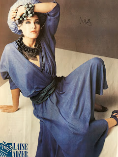
Let's talk about this dress, atypical though it be.
Miami Vice on horseback! The folds point at, and expire upon, the kneecap.
Thin, stretchy fabric, gathered and un-gathered.
Great folds, well lit. These are the (cotton chambray??) shirts and puka-shell necklaces real men wore in those days, if you were wondering. Don't you question me; I was there.
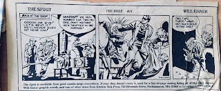
Will Eisner's The Spirit was very influenced visually by film noir. The dramatic lighting and the thicker fabrics and roomier suits of that era play a major part in its look. Great thing about film noir lighting? It conveys a lot of dimension with minimal, stark, binary, dramatic visual info.
LATE ADDITIONS!.........
Jeans! You gotta know how to draw jeans. Imitate the pattern of folds here, with restraint. Note that that the staggered-diamonds pattern is most intense just at the moment the foot is fully swung forward.
A classic sleeve position... Reaching forward some, arm bent some... Note the "double-backs" of the accordion-ed parts, and beside them the arcing stretch folds, spiraling around the shoulder. Most of these lead right to a double-back.
In our in-class exercise, I cited Mike Mattesi's inspiring book FORCE, then forgot to pull it out of my book bag! Here is a link to a short video on that powerful philosophy of drawing: https://youtu.be/tYFqld6kzVA
John


No comments:
Post a Comment