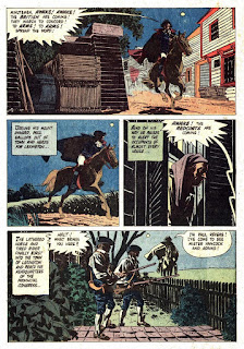
Expression/Expressionism
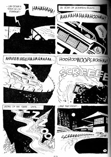
Artist Mandrafina made a non-literal background of big black shapes to express these guys' joy at the apparent death of their enemy.
Additionally, dropping simple shapes behind figures makes them come forward, because our mind interpolates the rest of the shape, perceiving it as existing, in full, behind them.
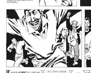 |
| Mandrafina, The Big HoaX/ The IGUANA |
Weirdness
Making people look creepy with uplighting! Classic.
 |
| Mandrafina, The Big HoaX/ The IGUANA |
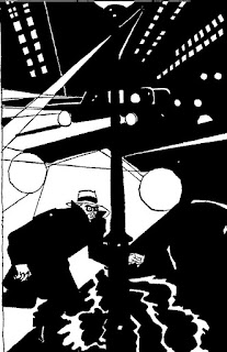
Evoking the Unknown
What terrors lurk in the jungle? We see only some suggestions in the mysterious blackness of night. It connects with our most primal fears.
 |
| Mandrafina, The Big Hoax/ The IGUANA |
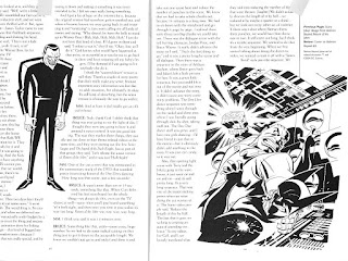
Fixing Characters in 3D space
...with well-drawn drop shadows that accompany the military guy, making him look very
there.
 |
| Mandrafina, The Big Hoax/ The IGUANA |
Evil! E-e-evil, I tells ya!
Bruce Timm makes great use of black and aggressive pointy shapes to add brutal power.
 |
| Bruce Timm |
Design
Russell Patterson was as much graphic designer as cartoonist, and he was a fantastic cartoonist. Note how he uses the panel border and the lifeguard to break up the big black, potentially oppressive umbrella shape. For story reasons, he uses black to group the women, and sets them at an unfortunate remove from the boy. His isolation from where he wants to be is made clear.
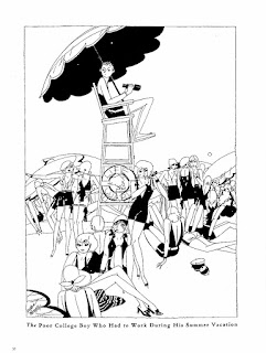 |
| Russell Patterson |
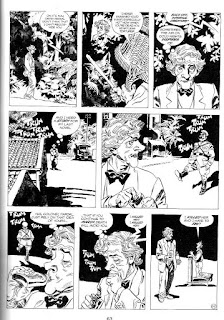
Not Sure
What does this one demonstrate? You decide; I'm admiring how Patterson held the man's form against, and by, the mostly black patterned door. Also, the whole thing is beautiful.
And one student Saturday noted the success of the composition: how her dress's train points at him, as his shoes point at her. Their overall shapes complement each other in a way that keeps our eye cycling around the two of them, relegating the beautifully arranged background elements to. supporting roles.
Achieving Beautiful Minimalism
Alex Toth, using the drop shadow of the gun so show how close it is to the hero.
Letting the airplane be mostly black, breaking up the black of the doorway of the hangar with the wing (and there balloon), using the long shadows fix the position of the men in space, having those shadows carry on, to the right of the plane, knowing the shadow of the wing will fall on the prop. Toth does it all, and makes it look easy.
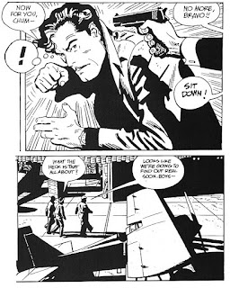 |
| Bravo for Adventure by Alex Toth |
More Mandrafina?
Sure: Check the silhouette, emphasizing action and pose in panel 3. In the next-to-last panel, look at how he uses white-against-black-against-white so he can dispense with outline almost entirely. He lets your brain finish the brim of the hat. Nice trick! Looks so good. Awesome, accomplished almost-unknown artist.
 |
| Mandrafina, The Big Hoax/ The IGUANA |
|
Masterful use of repetition to show time passing, through 3 panels. Look how astutely he changed the lighting on the church as the moon sets.
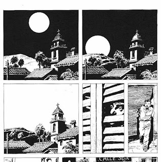 |
Mandrafina, The Big Hoax/ The IGUANA
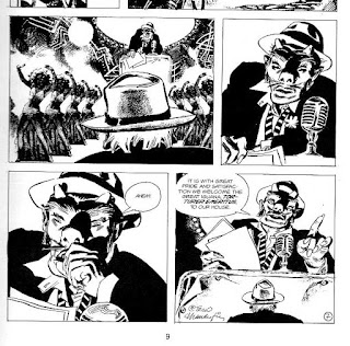
Seriously! How about this guy? |
Separation of planes
In page-spanning panel 5, Wendling expertly uses a background of silhouetted trees to create a background plane that pushes the contrasting log forward into the middle ground. The restrained use of black shadows on the log and roots effectively makes a different "color" for that plane, separating it from the more distant, entirely open (i.e., white) part of the bank.
 |
Claire Wendling
|
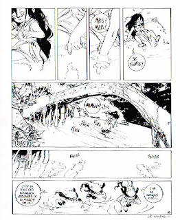
Off-Topic Interlude
I'm always stressing line weight variation, line quality variation, because it bring such graphic life to our art. I feel that if you are going to use a dead, nearly unvarying line, you are writing a big check. Those lines better be going just where you need them to go.
Here, Wendling makes good on that deal, using a clean, fine animator's clean-up line in a character drawing. Economy and precision. One way in which she does vary the line is in mixing straight and curved segments. Something her designs share with Bruce Timm's, and some classic Disney.
 |
| Claire Wendling |
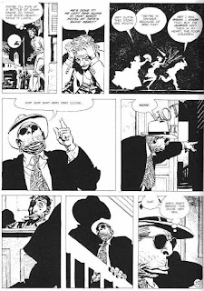
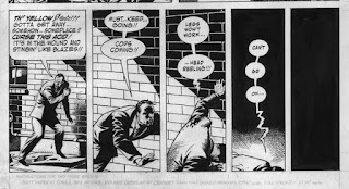
Depersonalization, Menace
Blacking in the faces of the soldiers in the next to last panel suggests so much: These guys are up to no good, they expecting to work anonymously, they are suppressing the human sides of themselves.
(You can achieve some of the same brutish feeling just by having the eyes disappear in the shadow of the brow. But make sure you're consistent: The nose, cheekbones and jaw should also create heavy shadows.)
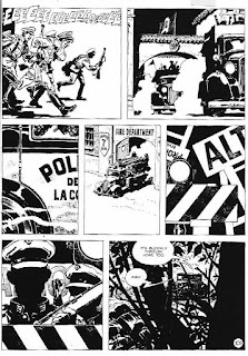 |
| Mandrafina, The Big Hoax/ The IGUANA |
Toth, the Super-Minimalist
Pure speed, no distractions. Toth drew a lot of hot-rod cartoons in the 60s.
 |
| Toth |
Design, expressionism and so much black...
...combine in a very simple Patterson drawing that is heavy with threat, anxiety, uneasiness and surveillance. The inverted buildings (yes?) menacingly point down at the fugitive.
 |
| Russell Patterson |
How do you create panels without gutters?
Alex Robinson says, alternate black and white backgrounds.
This is worth reading. Very funny in a snide, smug way, which is one of my favorite ways.
 |
| Alex Robinson Box Office Poison |
Okay, this is pure genius.
Influential superstar Kevin Nowlan uses an inanimate background element, a shadowed brick wall, to express a loss of consciousness!
 |
| Plastic Man Kevin Nolan |
Toth uses blacks to great effect
Look at how many objects are mostly black and how beautifully that works. He makes strong, simplified shapes primarily of black, but uses bits of white to sell the perspectives of the walls and to round out the cloaks as they turn toward the light. The bits also offer relief in what would otherwise be flat, monolithic blackness.
 |
| Paul Revere and Jonny Tremaine, Alex Toth |
The use of silhouette in panel 3 draws attention to their furtive motions as they approach the house.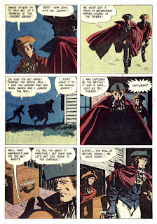 |
| Paul Revere and Jonny Tremaine, Alex Toth |
See you on 20 January, team!


No comments:
Post a Comment